
Looking good in photos is a skill that can be taught (hence the number of stories we've published on the subject), and one of the easiest ways to control that is what you wear. As you probably suspected, some colors look much better than others on camera, and who better to tell us exactly what they are than Lee Eiseman, the executive director at Pantone Color Institute and author of the book The Complete Color Harmony, Pantone Edition?
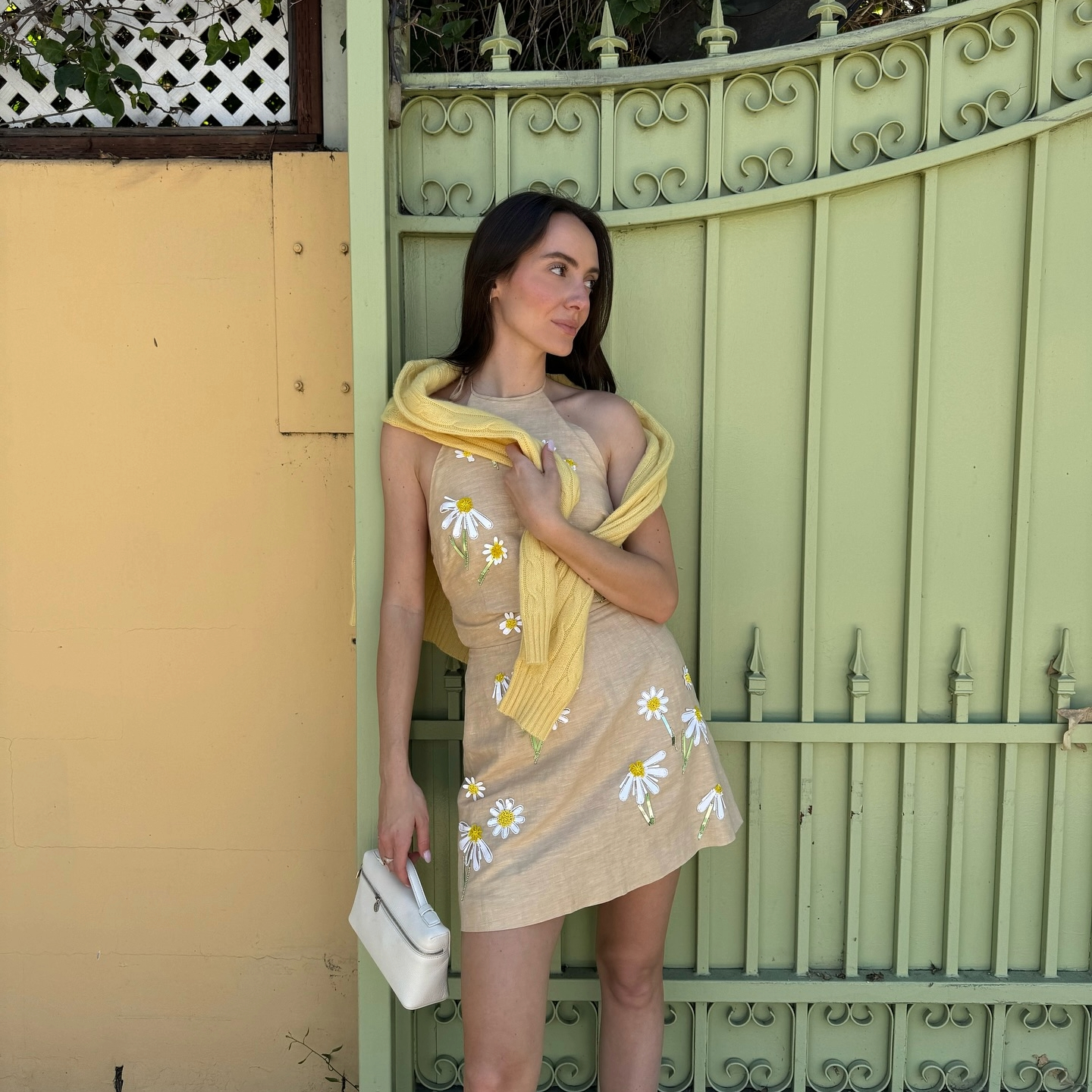
When it comes to the worst color to wear in photos, Eiseman told us, "Solid colors are always best, as opposed to patterns. Very pale pastels and whites can make the subject looked washed-out. However, color in makeup can help considerably, especially professional makeup application. Cameras sometimes have difficulty adjusting between very bright contrasts, so it's best to keep brights as solid pieces as opposed to separates."
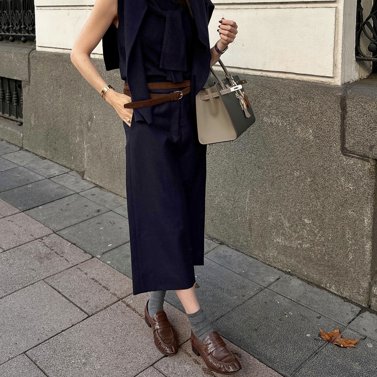
So what should you wear? Eiseman gave plenty of options for what colors to embrace, explaining that "the best colors are deep reds, teals/turquoises, and other shades in the blue-green family (the most universally flattering family of all colors). Rich and deeper greens, purples, and blue are all good. If a neutral is preferred, gray is the best, even better than black. Earthy and warm browns are good. Black and white together can offer too much contrast as well. Mid-tone or more vibrant rose-pink tones and corals are flattering."
Given your newfound knowledge of photogenic colors, you're probably ready to add some of them to your wardrobe, right? That's what we're here for.
Keep scrolling to shop pieces that will look great in photos.
ROSE

A puff-sleeved sweater is so photogenic.

So slick.
DEEP PINK/RED

A good red sweater is always a chic look.

Definitely going to be wearing this to a holiday party this season.

Pair with straight-leg denim and boots.
GREEN

This top is super chic and versatile.

This could be great for a daytime wedding.

I'm eyeing this look for date night.
PURPLE

I love a good collared sweater.

I'm a sucker for a leather skirt.

Just in time for sweater weather.
BLUE

It's almost time to bust out your favorite puffer.

This dress is a showstopper.

How adorable is this top?
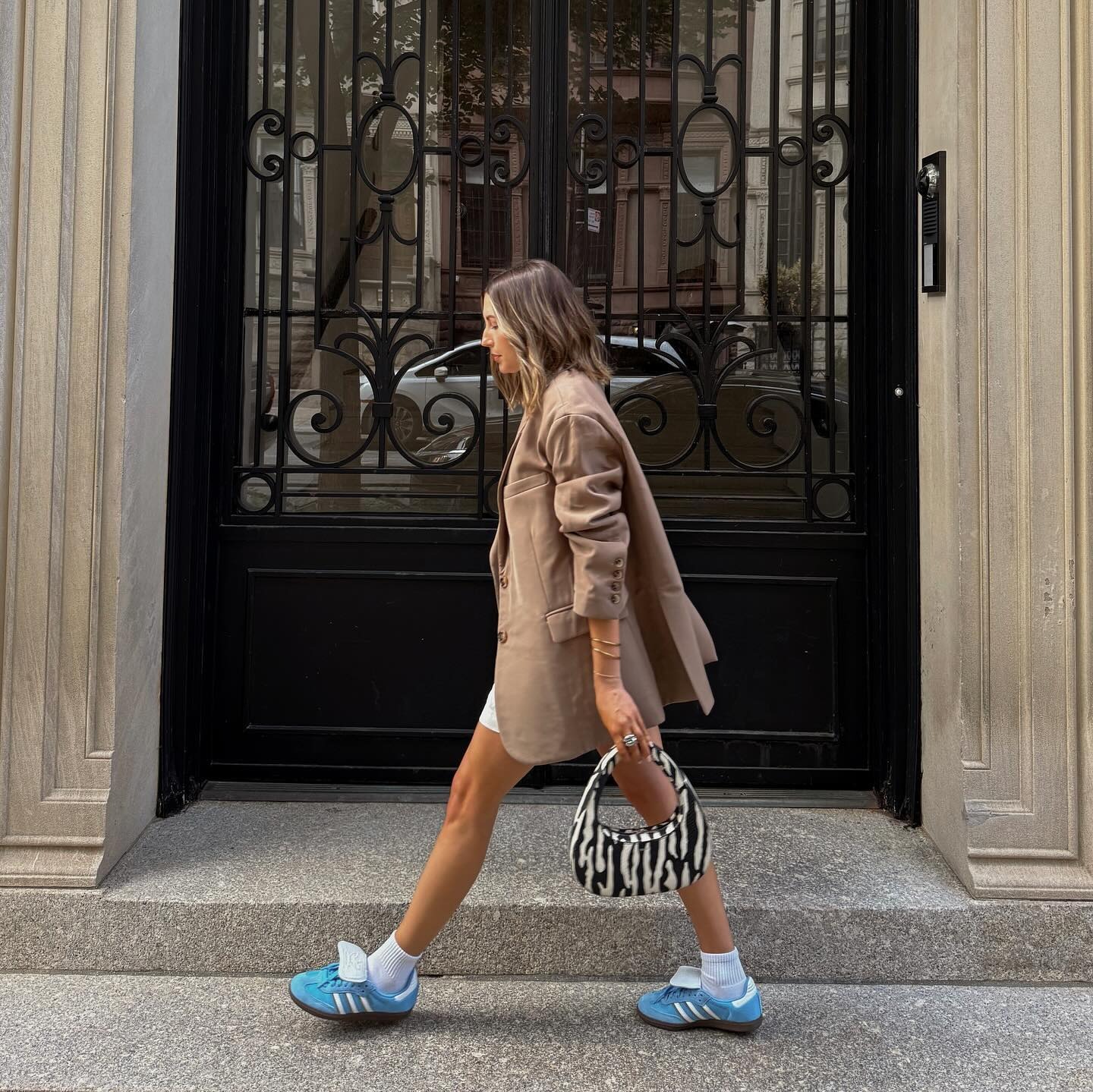
WARM BROWN

Obsessed with this sweater.

Big fan of this cropped cardigan.

The cutest sweaterdress.
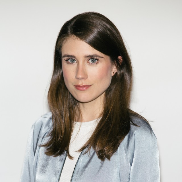
GRAY

There's something about this shade of gray that just looks expensive.

I'd pair this knit dress with boots.

I'd pair these trousers with a cropped turtleneck.
Next up, 15 Lazy Outfits That Look Anything But
This story was originally published at an earlier date and has since been updated.


-
 It's True—These "Tacky" Color Trends Will Be Considered Chic Again Come Fall 2025
Just go with me on this one.
-
 No Offense to White Dresses, But This Expensive-Looking Color Is Even Prettier
Sydney Sweeney and Emily Ratajkowski agree.
-
 Butter Yellow and Powder Pink Are Everywhere—These Are the 39 Best Pieces
*The* colors of spring '25.
-
 I Need More Color in My Wardrobe—These 32 Zara Finds Are Just Gorgeous
Mood boosters.
-
 This Elegant Color Is to Spring What Black Is to Winter
Tell your friends.
-
 There Are Bag Trends, and Then There Are Investment Bag Trends—That's What This One Is
Celeb approved.
-
 And Just Like That, I Want to Wear This Expensive-Looking Shoe Color Instead of Black
I never thought this day would come.
-
 All the It Girls and Celebs Are Shelving White Sneakers for These 6 Colors
Spring's most comfortable trends.


