
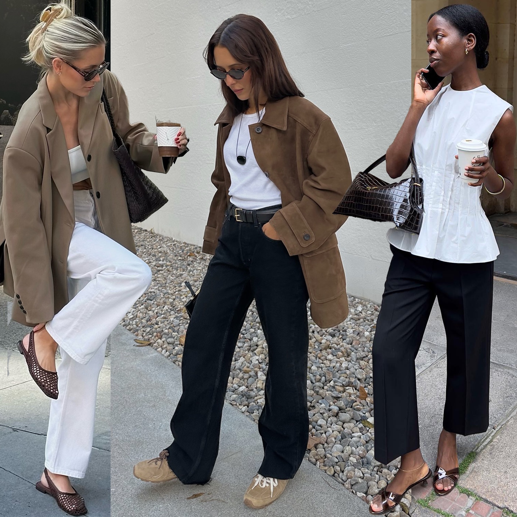
Level with us: Have you been counting the days on your calendar until fall? Same. Being that we're on the precipice of autumn, we figure there's no better time to talk about print trends—we need something to hold us over until the season starts, after all! Although it's easy to associate shifting your style into the autumn season by adopting specific accessories, we've always been of the mindset that prints are an easier way to make a statement. Rather than buying brand-new boots and bags every season, buying a printed piece (or two) is the perfect way to make your "boring" basics feel a bit bolder for fall.
But if you're unsure which exact patterns will allow you to pay homage to recent runway collections without having to revamp your entire closet, keep reading. To help you find out the best patterns to purchase for fall, we spent hours scrolling through recent runway collections and our past trend reports. Ahead, you'll find a breakdown of the seven biggest fall print trends for 2024, based on their prevalence on the runway (and in real life, too).
Whether you're a minimalist or maximalist, adopting any of these print trends will transport you forward in time without even realizing it.

It might be a bit predictable, but it's hard to discount the prevalence of pinstripes. Ever since this print trend first resurfaced, it's remained relevant because of how it's been continuously reimagined—including in recent F/W 24 runway collections. Taking notes from the real world, or, at the very least, the digital one, designers leaned into the "office siren" aesthetic by giving pinstripe separates a risqué spin through styling.
For example, in LaQuan Smith's show, a matching pinstripe navy suit was styled with a satin bra top with a built-in scarf (not exactly HR-friendly, but hot nonetheless). While other brands may not have been as brazen with their styling, by embracing "raunchier" necklines, hemlines, and silhouettes, they demonstrated that this print trend is far from predictable.


Much like pinstripes, animal prints have remained at the top of the food chain. But make no mistake—this trend has subtly evolved. Historically, animal prints have felt wildly over the top, but with the F/W 24 collections, they felt domesticated. Designers gave animal prints a more "prim" feeling by opting for sharply tailored silhouettes, muted colors, and textiles with texture.
For example, leopard prints were adapted into tailored topcoats at Michael Kors. At Jacquemus, a pristinely tailored pencil skirt came in a punchy ponyhair zebra print. And then there was Tory Burch's fall show, which included a peplum top and matching pencil skirt made from a crocodile-embossed printed leather. Although varied in approach, each show proved yet again that the best print trends are the ones that continuously evolve every season.


Some prints have become synonymous with the start of fall, while others are not. Produce-inspired prints typically fall into the latter category. While the girls have always had to eat (excuse the pun), that doesn't negate that fruit and veggie motifs have primarily been relegated to spring collections. That said, designers broke from that tradition by incorporating nods to produce throughout their F/W 24 collections.
For example, Moschino had models make their way down the runway wearing silk separates adorned with leafy greens and life-like baguettes in hand. At the same time, we saw other brands give a whole new meaning to the term "girl dinner" by using produce-inspired patterns to make staples pop (see Loewe and Balmain). By embracing grapes and leafy greens, designers gave us something to chew on this fall.


If you were to fantasize about the start of fall, chances are something tartan-printed would appear in the vision. Like it or not, plaid patterns have always been a part of the fall mood board. But we'd argue that designers made them a bit dreamier in their F/W 24 collections by committing to their tones (both literally and figuratively). Not only did versions of this print center neutral colors, but designers also styled the print in a more bohemian way.
A prime example of this would be Chloé's collection, in which a plaid funnel-neck cape was draped over a black bodysuit, a gold belt, and brown over-the-knee boots (very reminiscent of '70s fashion). But there were other examples of the tartan print trend, too. Burberry's show featured a tartan maxi skirt styled with a leather moto jacket, while Schiaparelli's ready-to-wear collection had a printed coat paired with Western boots. Each show proved that some patterns nail the tone of fall every time.


The writing is on the wall, or in this case, the runways: Typography prints are back in the chat. Since last spring, we've seen graphic prints pop up again, but they're not necessarily an exact rewrite of the past. Instead of slapping a brand name on the front of an oversize T-shirt, designers decided to be more cryptic throughout their F/W 24 collections. Textiles were covered in what, in essence, looked like typos but were an intentional way to incorporate text without spelling things out clearly for the audience. Case in point? Bottega Veneta. Matthieu Blazy's cited inspiration was the news cycle, evident in a draped halter dress covered in nondescript newsprint. Although this take was a bit more abstract, even other fashion houses took a less obvious approach to incorporate their brand's moniker by playing with proportions and opacity (see Dior and Baum und Pferdgarten's shows). By incorporating typography in a less obvious way, designers pushed us to read between the lines, thereby creating a far more compelling story for fall in the process.


In alignment with the more abstract take on typography, we've also seen designers embrace a more artistic approach to other prints (quite literally). Drawing from the rich history of the abstract art movement, designers incorporated patterns into their F/W 24 collections, which felt akin to the watercolor paintings you'd find hanging in a contemporary gallery—except, well, wearable. At Fendi's fall show, Kim Jones drew inspiration from the Italian house's heritage by taking literal inspiration from Roman statues that were screen-printed on silk gowns. Similarly, at Roksanda, the eye was naturally drawn to the intricate draping on capes and dresses because they were covered in a mural by the late architect Le Corbusier. For Dries Van Noten's final ready-to-wear show as the creative director, he chose to nod to the history of the house by incorporating contemporary brushstroke prints throughout the collection. By pulling from the recent artworks of the past, designers created a print trend that embodies the present artfully.


We've seen a collective shift in how designers see printed textiles, most evident through the wide embrace of clashing prints. While F/W 23 collections may have been about styling clashing patterns, F/W 24 is about bringing them closer together. Designers chose to double-layer mismatched prints not by layering, but by using various techniques.
In Erdem's fall collection, models wore draped floral coats that seemed to have the appearance of being spray-painted on top (the herringbone screen print gave the more classic silhouettes a contemporary feel). While at Versace, the house pulled from its archives to revive its Wild Barocco pattern (aka a gold medusa motif layered on top of a contrasting leopard print), which transported us back to when this contrasting print was first released in the '90s. And then there was Rabanne's collection, which bridged the gap between the past and the present by using contrasting prints to create a patchwork gown. Although each designer varied in approach, seeing double the number of prints on the runway this season showed that maximalism is still very much in their line of sight for fall.


-
 It's True—These "Tacky" Color Trends Will Be Considered Chic Again Come Fall 2025
Just go with me on this one.
-
 Just Some Really Good Buys for Spring—That's All
Thank me later.
-
 Try Any of These 5 Spring Shoe Trends, and You Won't Be Able to Stop Staring at Your Feet
I'm obsessed.
-
 Sorry, But Fashion People Are Already Ditching Leopard-Print Shoes for This Elegant Alternative
Here are the receipts to prove it.
-
 I Hate to Break It to You, But Dainty Jewelry Is Losing Ground to This Daring Trend
Condolences, minimalists.
-
 The Expensive Way Chic Women Will Be Wearing This $10 Accessory Come Spring
A stylish trick.
-
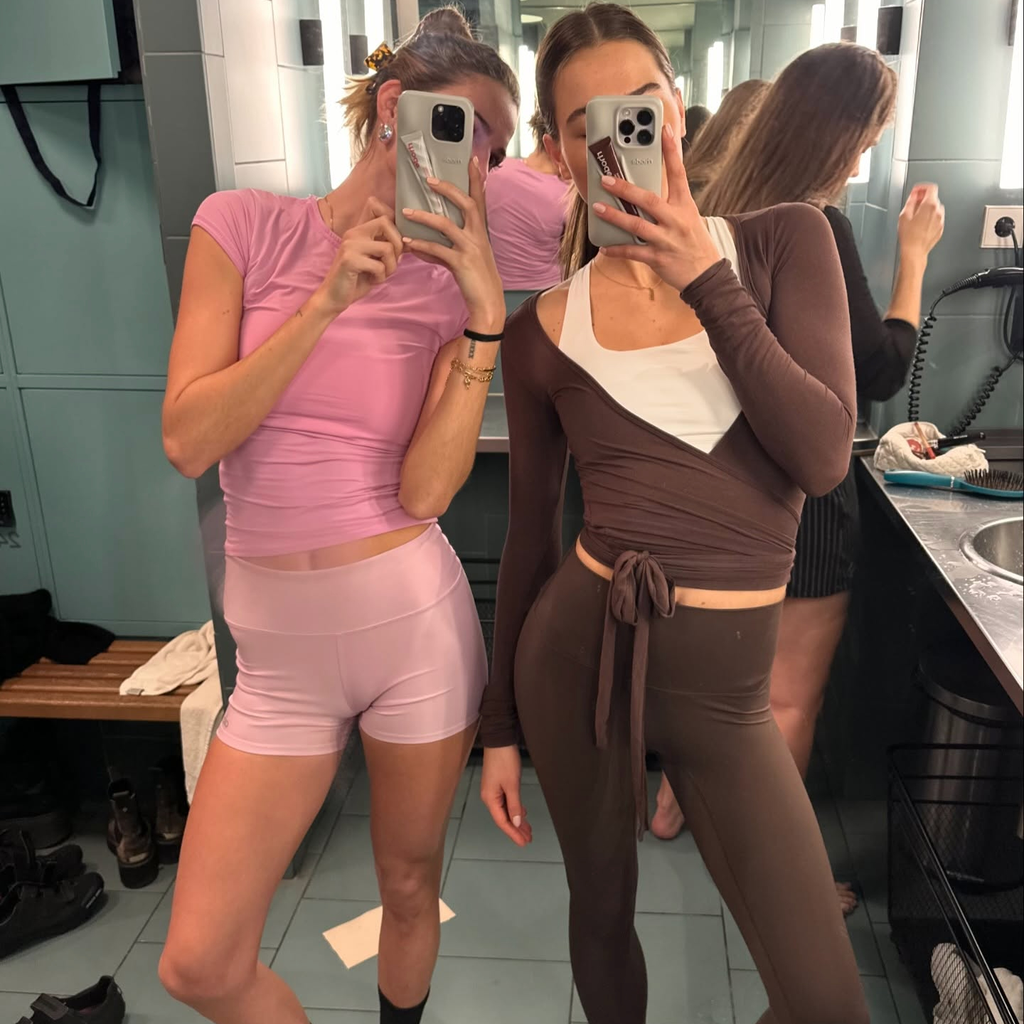 5 Activewear Trends I Spot in Every Pilates Studio in Manhattan
What NYC fashion people are wearing to work out.
-
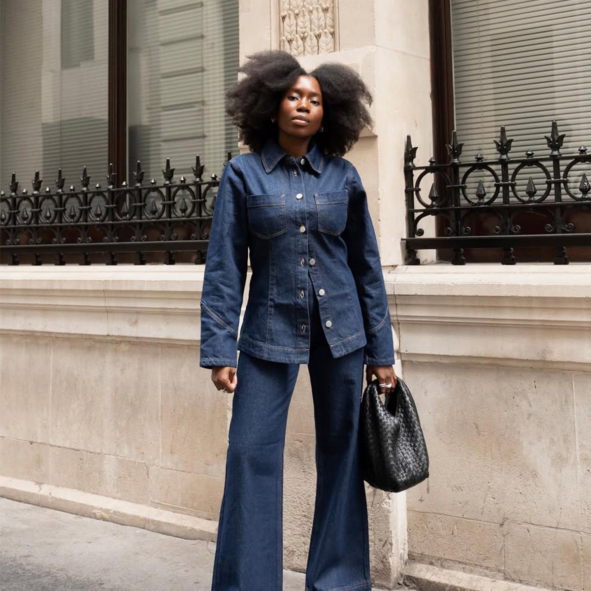 I've Felt Blah About Denim Jackets, But This Chic Update Just Made Me Do a 180
Elegant, no?


