There's nothing quite like the feeling of stepping into a new season. But as the days get longer and the temperatures rise, suddenly, our wardrobes can start to feel a little… off.
The chunky knits we lived in for months feel too heavy, our trusty black coats are a little too serious and even our go-to denim can feel restrictive and boring. But beyond swapping out fabrics and silhouettes, the colours we wear also play a huge role in this seasonal shift. And whilst certain spring colours naturally lend themselves to the lighter, brighter feel of the season, there are a few shades that we don't tend to wear in spring—at least, according to the Who What Wear UK team.

For most of us, spring signals a return to pastels, soft neutrals and some more vibrant hues that reflect the season's optimistic mood. This is when powder pinks, breezy blues and soft yellows take centre stage, mirroring the blooming flowers and clear skies. But just as some colours feel right for spring, others—whilst great in other contexts—can feel a little out of place. Think about it. Have you ever thrown on a deep burgundy jumper on a warm spring day and felt like it just didn’t match the vibe, or reached for a bright yellow piece, only to realise it felt too brash for the mild temperature?
The spring/summer 2025 runways were a reminder of just how much colour impacts how we dress for the season. Designers leaned into fresh, uplifting shades. Pale pink featured heavily at Stella McCartney, where oversized blazers and fluid wide-leg trousers proved that the shade can be both powerful and playful. Buttery yellows at Valentino came in the form of dreamy chiffon dresses with cascading ruffles, along with delicate slip skirts and floaty coats that felt light as air—proving that yellow, when done right, can feel effortlessly elegant rather than overpowering.
Meanwhile, sage green at Chloé was seen in an array of breezy linen separates, flowing maxi dresses and sculptural outerwear that gave the neutral-leaning shade an earthy, almost ethereal presence. The message was clear: after a winter of rich, chocolatey browns, deep plums and burgundy, this season's colour palette is all about softness, subtlety and wearability.
Whilst there are no hard and fast "rules" when it comes to which colours to wear when, there are a few shades we're personally stepping away from this season. And before you panic, we've got just-as-chic alternatives that will work even better.

Whether it's down to how certain shades sit against your complexion, how they clash with spring's natural light or just how they feel in warmer weather, here are four colours to reconsider this season and the shades to swap them for instead.
Colours to Skip in Spring
Avoid: Burgundy
Choose Instead: Pale Pink

Style Notes: Burgundy is a classic autumn and winter shade—it's rich, warm and pairs beautifully with heavier fabrics. But in spring? It can feel a little too dark, especially when the days are bright and fresh. Pale pink, on the other hand, offers that same sense of sophistication but with a softer, more seasonally appropriate feel.
Our SEO writer, Ava Gilchrist, thinks the same. "Personally, I avoid any wintery colours like burgundy and navy. Whilst they're timeless shades, I feel they're more attuned to enhancing cool-weather outfits rather than signalling the balmy climate and languid atmosphere spring encourages. On the other hand, I would never wear anything too bright or saturated. Instead, I prefer pastels or lighter shades like pale pink to lull me into the warmer months that await."
Shop Pale Pink:

A great transitional piece. Wear it with jeans now, then drape it over a slip dress when it gets warmer.

The easiest way to freshen up your wardrobe. These feel modern and make neutrals pop.

Ballet flats are a versatile spring staple. This pair adds polish without feeling too dressed up.

Just the right size for spring outings in a shade that feels cute and elegant.
Avoid: Yellow
Choose Instead: Light Blue

Style Notes: Yellow is a divisive colour. Whilst soft pastel tones were all over the S/S 25 runways, certain shades—especially bold, mustardy yellows—can be tricky to style and sometimes overpower rather than complement a look. Light blue, however, is universally flattering and gives that crisp, clean feeling we all crave in spring.
"As lovely as yellow is and as much as I like to debunk any and all outdated fashion 'rules', I can just never make the shade work for my pale complexion and light-blonde hair colour. Pretty pale yellows really wash me out, and anything brighter just doesn’t feel 'me'. Although I’ll be swerving it this spring, it is a major colour trend for the season ahead, so if you like it, then don’t let my personal opinion deter you," says deputy editor Maxine Eggenberger.
"Instead, I’m more interested in exploring ways of incorporating classic light blues into my looks to hit refresh after a winter of wearing mostly black. A billowing cotton shirt tucked into jeans, sky-hued dress worn with my favourite brown accessories or a slip skirt styled with my favourite cream knit—that’s what I’m envisioning for myself for spring 2025."
Shop Light Blue:

A one-and-done outfit that's perfect for spring days.

How pretty is the tie cardigan?

Alaïa Le Teckel bag in this light blue colour ties everything together.

The go-to shoe for warm-weather dressing, espadrille wedges give height without sacrificing comfort.
Avoid: Lilac
Choose Instead: Cherry Red

Style Notes: Lilac has been a spring favourite for years, but it doesn’t work for everyone—especially those with cooler undertones. If you've ever felt like lilac washes you out, cherry red is the alternative to try. It's bold and vibrant and brings an unexpected edge to spring dressing.
Rebecca Rhys-Evans, branded content editor for fashion and beauty, knows that lilac isn't for her. "As much as I love pastels when other people wear them, certain tones on my fair skin just don’t do me justice. Lilac washes me out and makes me look the opposite of glowy, rosy and refreshed, which is how I'd like to look at this time of year. Instead, I opt for strong reds. This is, of course, when I deter from my usual palette of white, cream, navy, grey and black (yes, summer black is a thing!)."
Shop Cherry Red:

Posse's popular Matilda vest comes in a vibrant cherry red this season.

The full co-ord is a great way to introduce colour into your wardrobe.

If you ask me, every spring wardrobe needs a red cardigan—especially if you live in the UK.

Red Mary Janes are so French.
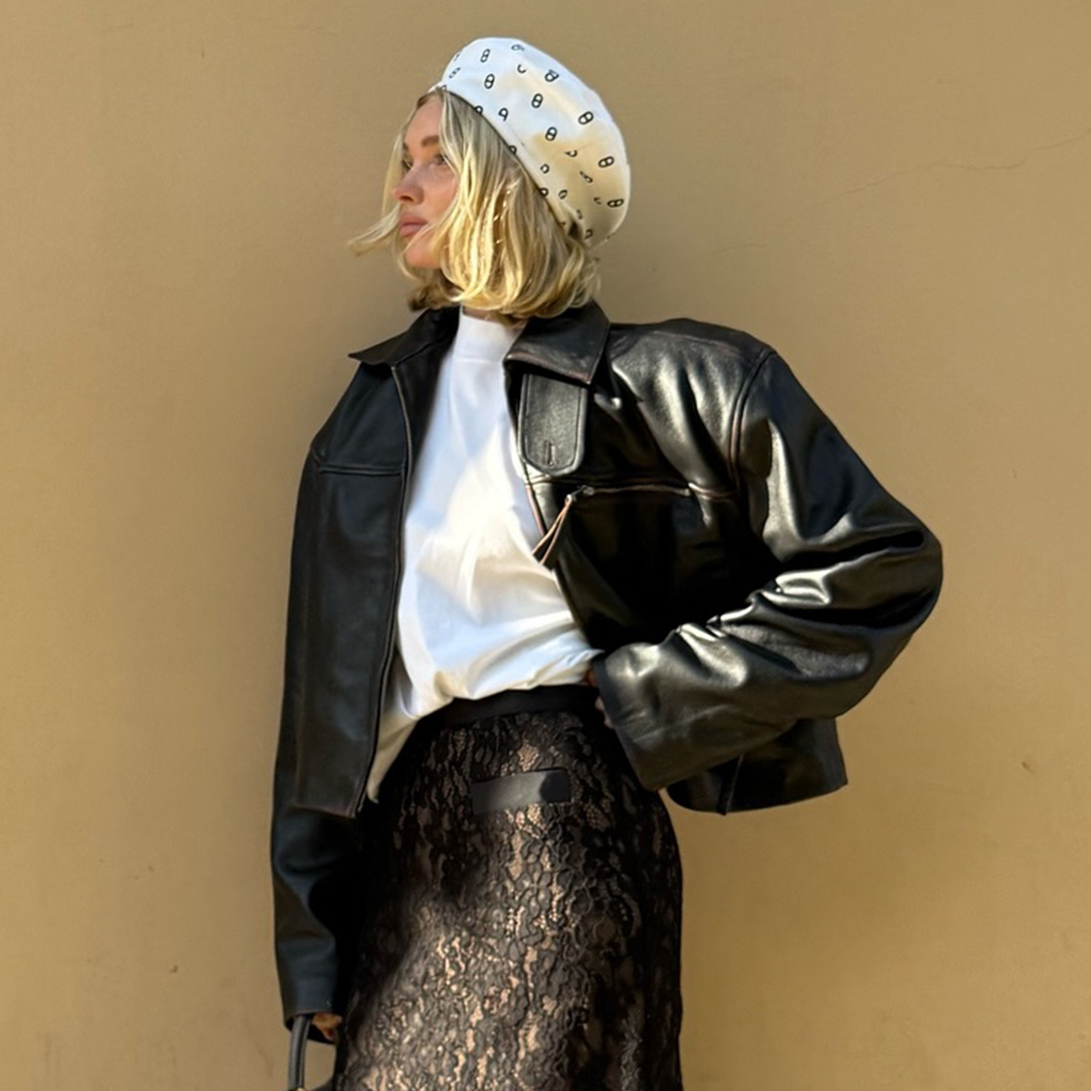
Avoid: Black
Choose Instead: Sage Green

Style Notes: We all love black—it's chic, timeless and easy to wear. But in spring, it can sometimes feel too heavy and stark, especially against softer seasonal shades. Enter sage green. It's just as versatile but has a lighter, more organic feel that fits perfectly with spring’s aesthetic. As a lover of black, this is the one colour I'm surprised has made it into my neutral wardrobe. Sage green is the neutral I never knew I needed. It's a subtle green, so it still makes a statement but doesn't feel too bold against the rest of my wardrobe. I'm pleasantly surprised at how well it sits with the rest of my rotation.
Shop Sage Green:

A dress that will work for so many occasions.

For when you need a light layer to leave the house but don't fancy a blazer or cardigan.

My dream spring bag.

I'm manifesting sunnier days with these flats.


-
 Got Taste? I Picked 37 Revolve Items Just for You
Enjoy.
-
 10 Spring Outfit Ideas That Will Make Anyone Look Like a Fashion Person
Bring on the compliments.
-
 Nordstrom Just Put Its Sale on Sale—These 11 Basics Are Regret-Proof
Peep our top picks.
-
 The Anti-Trend Pant Style Set to Upend Black, Blue, *and* White Jeans This Spring
It's probably not what you think.
-
 I Just Found 32 of the Prettiest Pieces I'll Be Wearing All Spring From Free People
Including brands like Geel and Camper.
-
 Katie Holmes's New Sandals Are Causing Controversy on Reddit Right Now
Here's why.
-
 Free People Has the Cutest Shorts, Skirts, and Jeans Right Now—Shop My 12 Faves
Hop to it!
-
 Just Some Really Good Buys for Spring—That's All
Thank me later.


