
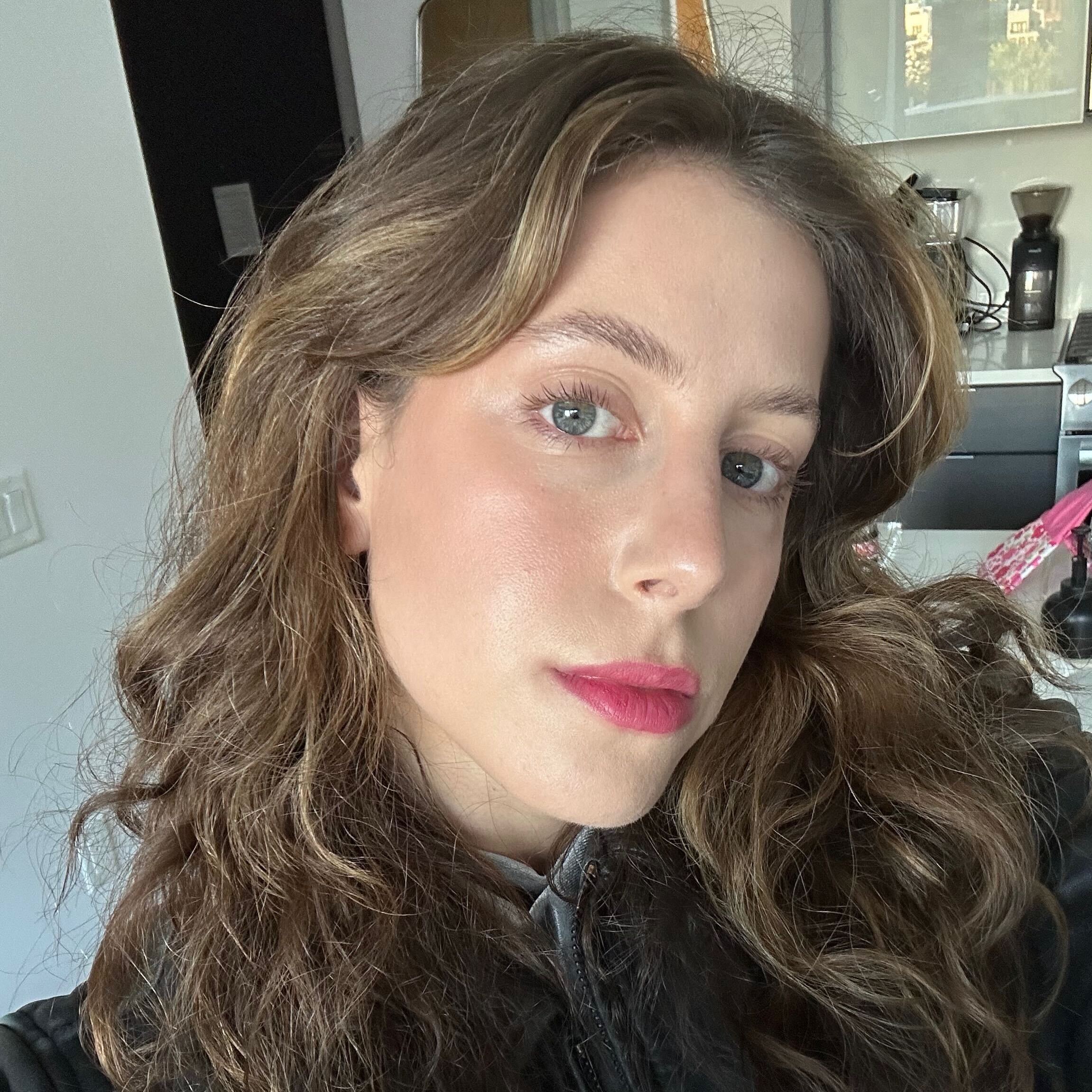
I always knew I looked better in earth tones. I'm team brown over black mascara (whenever I do wear it, anyway), and I have more terra-cotta, chartreuse, and olive green hanging in my closet than I know what to do with. I'm also an earth sign (happy Taurus season, folks!), so I had always chalked it up to my spiritual subconscious seeking out grounding, muted neutrals. It wasn't until I walked away from Seklab, a personal color analysis studio in NYC, that I finally understood my affinity for rustic hues. Apparently, I'm a warm autumn—what's your seasonal color palette?
The question is only becoming more common here in the States (thanks to TikTok, of course), but color analysis has long been a coveted service in South Korea. "It's huge in Korea," Lizzie Heo, color consultant and founder of Seklab, tells me. "There are as many color analysts there as Starbucks in America." Here, studios remain rather exclusive joints (Seklab releases appointment slots six weeks in advance and typically has a crowded waiting list), but the demand is only expected to climb. After all, who wouldn't want to know what clothing, hair color, and makeup and nail shades suit them best—and which ones to avoid at all costs? I'm certainly game, which is why I decided to let Heo overhaul my entire beauty routine.
Of course, I'm also aware that there are plenty more things to worry about in this world than wearing the "wrong" blush or polish color. Makeup should be fun, first and foremost, and even Heo tells me not to limit my product choices based on what I discover during my appointment. But if you're hoping to find your most natural-looking makeup shades or nail colors—say, for your wedding or any other important, highly photographed milestone—knowing your seasonal palette can be a major perk. I had an inkling mine would include earthy tones, but I was genuinely surprised by a few suggested swaps. Fellow warm autumns (or anyone remotely color analysis–curious), scroll ahead.

The Seklab Color System
"There are four different aspects that we consider," explains Heo. First up: undertone, which you might already be familiar with in the context of makeup. Everyone has underlying colors beneath the surface of their skin, regardless of their actual skin tone. Do yours lean cool or warm?
Once making that assessment, Heo will then consider the saturation of those cool or warm tones. "Some people look better in vivid, bright colors; some people need pastels," she shares. For example, let's say your colors fall in the delicate pastel camp. "If you're wearing darker colors, then it's going to look like you're wearing mother's makeup. It's not going to suit you well," Heo explains.
Then she considers the value, which refers to the lightness or darkness of a color (different from saturation, which refers to a color's intensity.) "The last one will be the clearness of the color, versus the softness [or] mutedness of the color," Heo explains. "Combining those four aspects, I will find your best palette."

Heo explaining her color system
While assessing these four aspects, Heo will also help you discover which "season" you are. Spring and autumn, for example, both contain warm color palettes—but the difference lies in their value. (Spring is lighter, while autumn is darker.) Summer and winter are on the cool side of the spectrum, but their saturation is completely different. For instance, people with a winter palette look best in vibrant, crisper colors. "When they wear a summer's color, it's not even going to show up. It's going to look like they're wearing lip balm instead of actual lip gloss," notes Heo.
Then within each season, you'll find sub-seasons with various levels of intensity: soft, warm, and deep. A delicate dance of narrowing down tones, value, and vividness will ultimately help you land on the perfect palette.
My Experience and Results
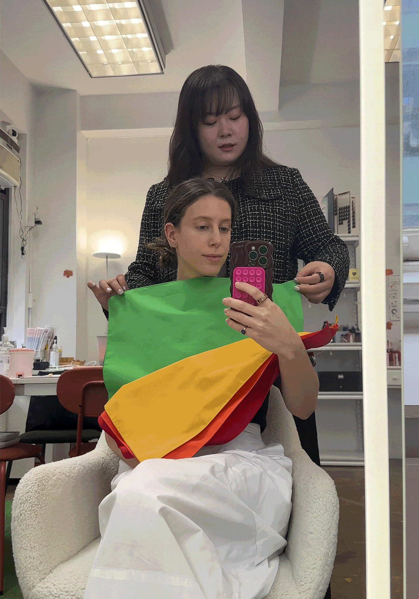
Before jumping into color swatches, Heo and I sit at her desk, where she measures both sides of my face with a digital skin analyzer. "It detects the amount of yellowness and redness that you are born with, and it's going to tell me the brightness of your skin," she explains. From my baseline number, she can already tell that I have warm undertones and will likely align with the autumn or spring season. That said, "We usually trust [the analyzer] only 70% to 75% because you might be coming in here with a little more redness from vacation or from the cold weather outside," Heo shares. It's more about helping her choose which palette to start with before heading over to the chair.
I tie back my hair, plop down in front of the full-length mirror, and assess each fabric swatch Heo places in front of my chest. Like she suspected, warm tones suit me best. "The warm colors make you look more sun-kissed," she notes, whereas cooler colors cast a blue-green shadow on my skin, making the veins on my forehead and underneath my eyes more prominent.
Next up is saturation, which we discover I can handle—to an extent. Low saturation certainly washes me out, whereas a higher saturation helps define my face shape. "Some people just get overpowered, [but] it's working well for you," Heo explains. "Some with the high saturation kind of turn into the color that they're wearing." That said, there is a point where saturation has diminishing returns, as my skin does start to reflect the color the higher we go. "Medium to high saturation is best, so it doesn't overpower your features or wash you out," says Heo. Noted!

Given these findings, we were able to narrow down my palette to a spring or autumn—just as the nifty skin analyzer predicted. After gauging the value and clearness of a few more swatches, we finally confirmed an autumn palette. "Lighter colors tend to be too bright or not enough, so I had to move down to the lower [autumn] values," Heo explains. Then, of course, there are the sub-seasons to consider. Because I need a higher saturation, soft autumn is out of the question. "The color is not as vivid or strong," Heo says, which makes my skin look a bit dull. Hues that are too vivid, however, start to overpower my features, so warm autumn—the middle of the spectrum—is the winner.
"You want to go for colors like cafe latte brown, Prussian blue, brick red, burnt orange, and olive," Heo shares. "[For] your basic colors, you still want to choose from the warmer palette—cream, milk, and ivory instead of icy pink or grayish white. Your worst colors are the winter brights—neon yellow or bright pink—and [colors that are] too grayish."
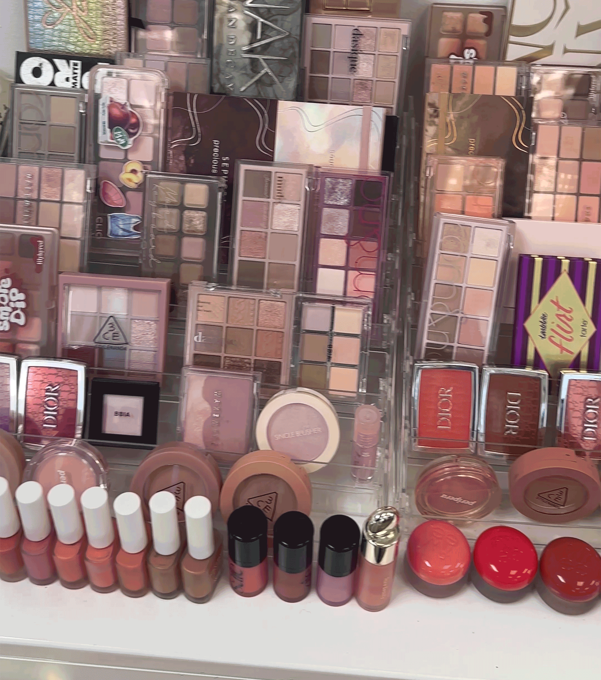
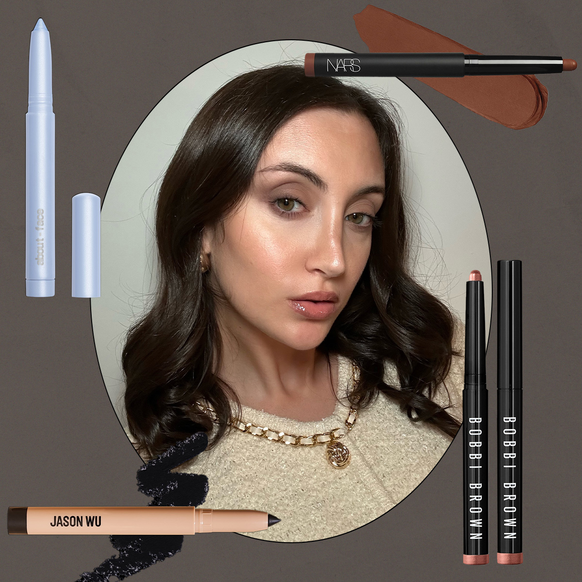
We then saunter over to the makeup counter, where Heo has tons of shades to swatch and test in real time. She pulls a few standout products (some of which I already own and use daily—phew!) and we go over which hues will suit my warm autumn palette best. Find everything I learned below, including my current swaps and product selects.
Just one note before diving in: Makeup is ultimately experimental, personal, and, hopefully, enjoyable. So if a certain eye shadow shade or lip color brings you joy, please don't let your color analysis keep you from playing—even if it's not technically your "best" hue. I, for one, will always love a cool-toned chrome moment, even though it doesn't exactly align with my warm autumn vibe. That doesn't mean it's off limits! Heo simply recommends balancing out the look with a champagne-gold highlighter or peachy blush to warm up my complexion, plus a good concealer to make sure my under-eyes stay nice and bright.

My Warm Autumn Makeup and Nail Colors
Out: Taupe and Espresso
In: Chestnut and Chocolate
Generally, warm-toned browns with yellow undertones—think cafe latte, chestnut, and chocolate—will best suit my skin tone. "You can go for espresso brown as well, but once they have a little bit of gray mixed in—like an earthy beige color—it's not as nice," notes Heo. Anything with gray undertones can make my skin appear ashy, so she recommends avoiding dusty taupe and dark brown eye makeup. "Once it gets too dark, almost black, then it's only casting shadows," she adds.


Out: Powder Pink
In: Peach, Coral, and Rose
Pale, powder pink is certainly on-trend, but I'll fare much better with warmer pink tones. "Peach will be better—even better is coral," Heo shares. I already gravitated toward rosy, peach-toned blushes as opposed to icy, bubblegum pink, so I'll continue to reach for those peachy hues.


Out: Beige
In: Cream and Ivory
When it comes to neutrals, "having that warmth is the most harmonious," says Heo. Think milky cream, ivory, and marshmallow instead of stark white. "Even with nails, I wouldn't really go for sand or beige colors, because it casts dark grayish [shadows]," she adds.


Out: Chrome and Pearl
In: Gold and Copper
"Oh, look how glowing your skin becomes!" Heo says when she holds a swatch of gold fabric up to my chin. When it comes to metallics, gold is essentially a warm autumn's neutral. "Even rose gold is also a great option," she explains. Pearly highlighters are certainly ethereal, but she recommends I opt for luminizers with more of a champagne or rose gold finish.


Out: Cobalt and Lime
In: Olive and Indigo
Yes, I can don blues and greens as a warm autumn—so long as I stick to warmer versions of the pigment. "Something like Prussian blue or indigo," Heo suggests, as well as olive green. True blues and lighter greens tend to wash me out or accentuate the blue veins underneath my eyes.


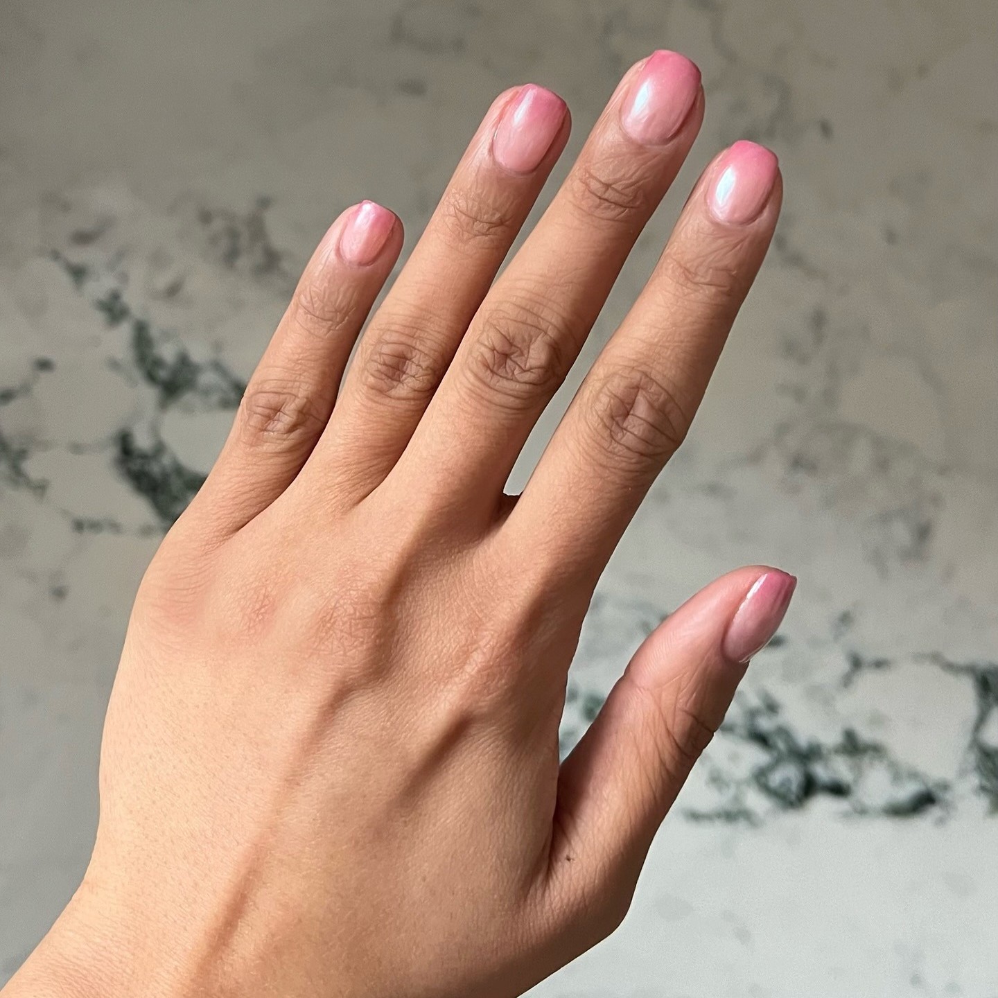
Out: Cherry
In: Brick and Blood Orange
As much as I adore cherry nails, the bright, purple-toned hue doesn't quite suit my skin tone best. (That said, I have been known to dabble in a chic maraschino shade every once in a while.) According to Heo, I should opt for blood orange or brick red on my nails and lips. Time for a picante pedicure, I guess!


-
 Inside the Brain of a WWW Beauty Editor—5 Summer Mood Boards With Endless "Add to Cart" Potential
Your warm-weather inspo awaits.
-
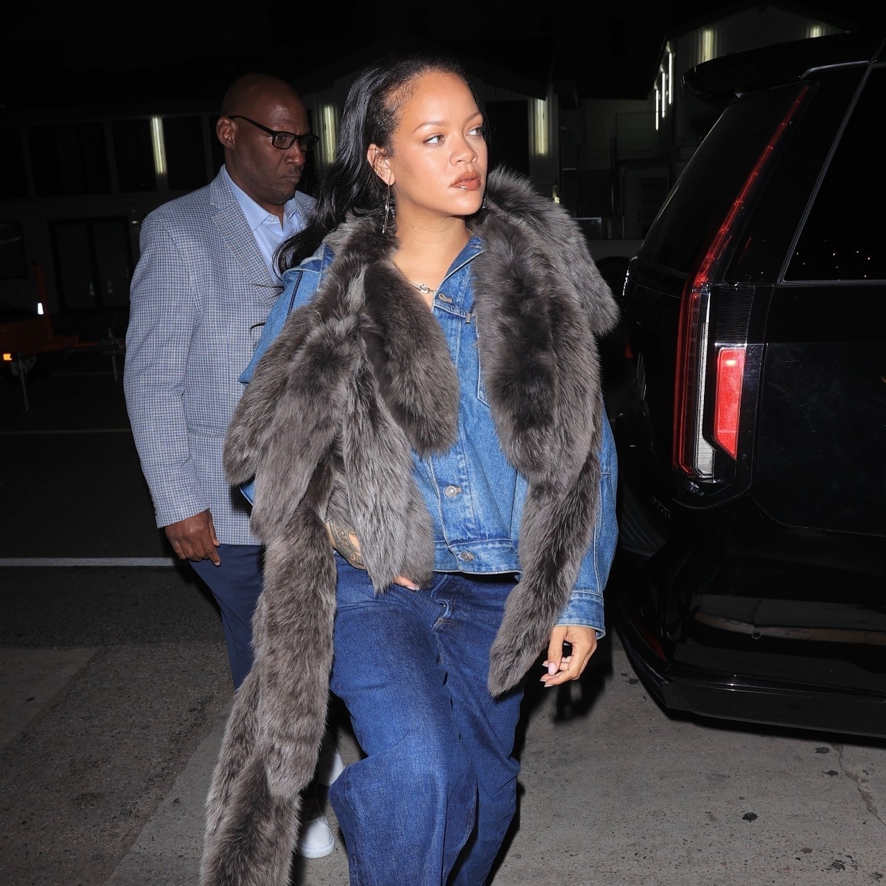 I Thought I Was Over This "Juvenile" Nail Color, But Rihanna Just Convinced Me Otherwise
Perfect for summer.
-
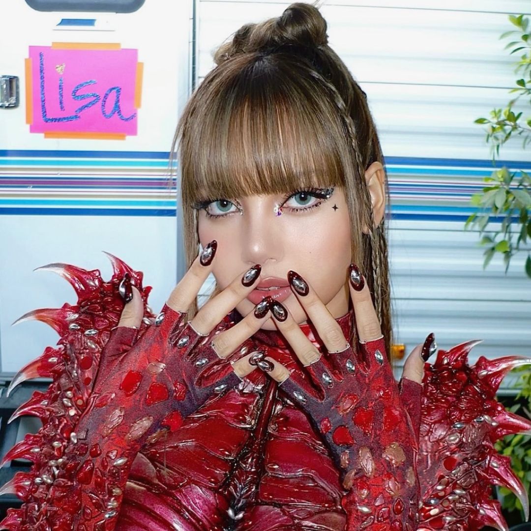 Lisa Just Co-Signed Selena Gomez's Go-To Date-Night Nail Color—I'm Sprinting to My Manicurist
This shade stretches way past Valentine’s Day.
-
 Confirmed: The Watery Nail Trend Is Set to Replace Milky Nails This Spring
Sheer nails just got an upgrade.
-
 I'm an Expert in Nail Trends—These Are the 6 Nail Colors Everyone Will Be Wearing This Spring
Fresh mani inspo.
-
 I'm Calling It: This Chic OPI Shade Will Be the Biggest Nail Polish Color of the Season
Neutral nail lovers, rejoice!
-
 I Know Expensive-Looking Nails When I See Them, and I'm Swooning Over This "Candy Floss" Mani
I couldn't have screenshotted it any faster.
-
 My Eye Shadow Stick Obsession Runs Deep, But Nothing Compares to This Crease-Resistant Fave
Plus, more options for mature and dry skin.


